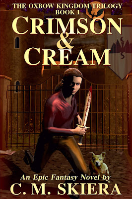
New Cover Reveal
Some of the most consistent feedback I've received on Crimson & Cream has been regarding the book's cover. In general, comments have stated it could be more professional (not surprising at all). Since I actually create my own covers (like you couldn't tell!), I decided to take a crack at a new image for Crimson & Cream that still maintains a consistent look with the other two books of the trilogy (i.e., font, size, layout, coloration, etc.).
I do have a plan to eventually get all three covers professionally re-done, but for now, I'm rolling out a replacement for the bloody sword and shield. The new image is a scene from the novel that I'd always envisioned would make a good cover. There's a lot of symbolism that refers to the trilogy in the new version (including retaining the iconography of the bloody sword and shield coat of arms).
If you're curious as to the process, I used Blender to make a 3D model of the entire scene, and then experimented with various 'camera angles' before deciding on the view I liked best. I then captured the selected view via a 'camera snapshot' and imported the jpg into GIMP, where I modified the 3D models to look less plastic and added more detail. I also own a very old copy of Corel Photo-Paint 9 that I used for certain visual effects. That's a very brief version of the process, which I've been tinkering with for quite some time.
I'm by no means an expert with Blender (or GIMP), but I do have some graphic design education and experience with 3D model capture using the old Dragon Age tool set, which had a 3D cut scene tool that's similar to some of the features in Blender. I realize I should really bite the bullet and pay for professionally-designed covers, but I'm a stubborn old man who enjoys making these images, so for now, you're stuck with my art work.
I'm satisfied with the digital image below, but may change my mind after I see it on a paperback proof. Depending on that result, I may further modify the cover. But for now, this is the new face of Crimson & Cream.

Comments
Post a Comment